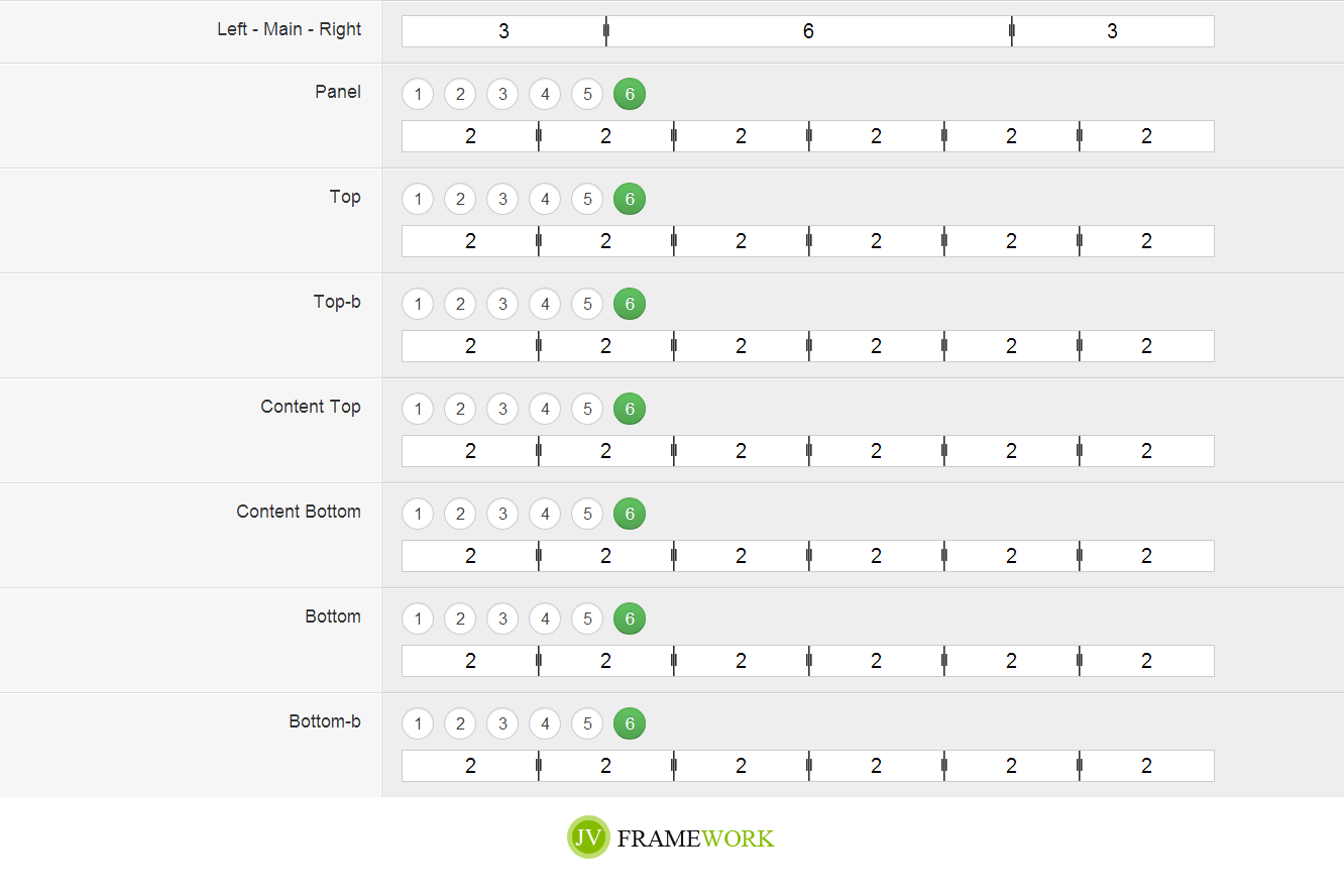
Grid system
Bootstrap includes a responsive, mobile first fluid grid system that appropriately scales up to 12 columns as the device or viewport size increases. It includes predefined classes for easy layout options, as well as powerful mixins for generating more semantic layouts.
Drag & Drop Builder JV FRAMEWORK
comes powered by our intuitive drag and drop page builder. This module-based system allows to you build your page visually without ever having to touch a line of code or deal with a sea of messy shortcodes. Drag your modules onto the canvas and re-size and rearrange them quickly and easily with your mouse. You can create advanced layouts using columns and nested elements, as well as integrate widget ready sidebars and plugins. JVFRAMEWORK gives you a completely new set of tools for creating and managing your content.

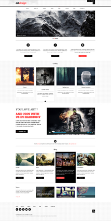
 Style 1
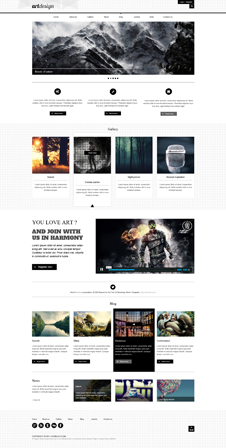
 Style 2
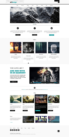
 Style 3
 Style 4